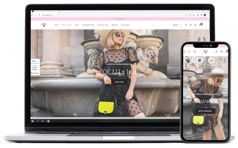
ZOÉ LU
The existing Shopify store of the handbag brand ZOÉ LU should not only adapt as well as possible to its target group, but also facilitate the daily work of the team. Before the optimization of the shop was with prestige theme, we worked on this in order to make the whole shop with focal theme with very good functionalities, also with a very good quality of test (AB TESTING)
Now, all the content of the shop can be adapted as flexibly and independently as possible without any programming knowledge
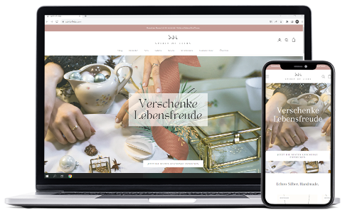
spiritofliebs
The goal for spirit of liebs was to make the shop more attractive and easy to use for customers, we have implemented functionalities and features such as:
– back in stock button
– Vertical scroll in the mobile version
– Payment icons, social proof
– New inspiration section in the PDP
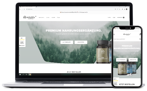
edubily
Together with Edubily we have been able to migrate to shopify while giving the shop a completely new look with a unique design that takes into count customer’s behavior and expectation. The page speed was also a major concern in our implementation.
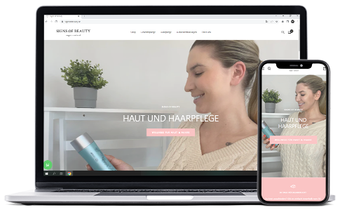
signsofbeauty
The focus was on the product detail page. The implementation of the BuyBox gave a pleasant look of the PDP. We also optimized the display of:
– free shipping text
– price and sales
– the ingredients of the products which are displayed as icons.
Dropz
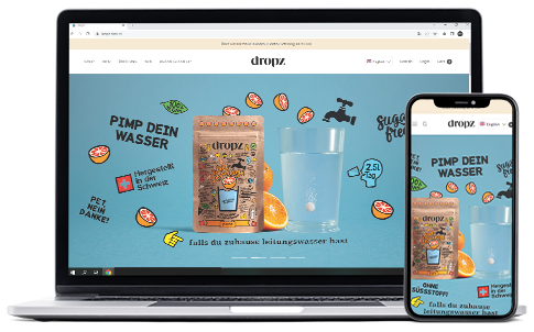
DROPZ certainly needed a beautiful design to reflet the quality of their products. The burger Menu in the mobile version with images of the category and the vertical scrolling bar in the PDP made the store so much fun to navigate.
golden strawberry
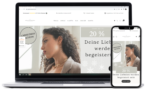
The operators of the online shop Golden Strawberry wanted to make it easier for visitors to the shop to choose the right jewerly for them. For this purpose, user-friendly size advice and a product finder were implemented. A HOTJAR chat element was also integrated to find out why the customer is visiting the online shop today.

dr-sahin
The expert in vitamins products wanted to give their Shopify shop a facelift that would reflect the high quality of their products. Ingredients of the products, quality, and guarantee seals as well as an FAQ area were integrated. The latter reduced the effort for answering e-mails immensely. Finally, the visual language and color psychology were also adapted to the preferences of the customers.
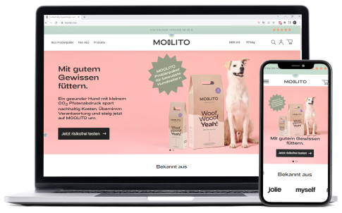
Moolito
In order to prepare for the big relaunch, MOOLITO entrusted us with the redesign of their shopify store from the start page to the checkout.
